Fun – Some Nights
This was on the back cover of Q Magazine. It is to promote
their new album as the target audience of the magazine is probably similar to
the TA of this music genre. I also found the front cover of the actual CD case
and their website. Their website colour scheme is yellow and black which is
probably why they have used these colours on this advert. However they have
used yellow as the more dominant colour here and not on the website because
they are the most contrasting colours and will attract attention of the readers
of the magazine. The CD case for Some Nights is the same as that being held on
the advert by one of the band members. This is a unique way of presenting it
but I think this would make the TA intrigued to find out what the album sounds
like.
 |
| FUN website |
 |
| Album cover |
Kate Rusby – 20
This advert was on the back of Mojo Magazine. It is
promoting her new album and upcoming tour dates. I looked on her website and it
is unusual that she has chosen purple as the dominant colour here as her colour
scheme on the website seems to be mostly pinks, blues, and vintage patterns.
The photo used on this advert is the front cover of her album which will help
the TA find the CD if they were interested in buying it. I have noticed that on
the adverts they include the logo of the record company in the corner so if we
were to make a promotion page like these ones we would have to put our logo in
to follow conventions. She has also included tour dates at the bottom of the
page, we could make up a tour for Morgan as more promotion.
 |
| 20 album cover |
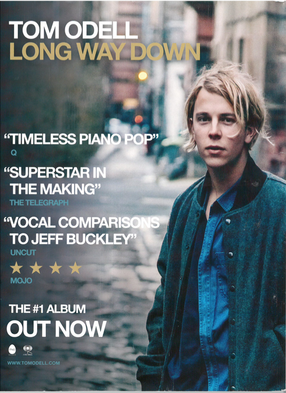
Tom Odell – Long Way Down
This entire page is filled with the photo used on the front
of his album cover for Long Way Down. The colour scheme is similar to that
found on the website, which introduces his house style. I find it effective how
there is a pull focus on the artist making the majority of the page out of
focus. The text is wrapped around the artist, which emphasises him as the main
attraction. This has influenced my research because I am now thinking of making
a page to promote Morgan as we could do it effectively but simply.
 |
| Website |
 |
| CD cover |
Jamie Cullum – Momentum
Again this is a simplistic but effective promotion page. The
photo used on here is an extended one of the album cover. They have kept the
colour scheme to the browns, blues, and golds used on his website which will
help the TA recognise him as an artist. As we are trying to launch Morgan, we
should keep to similar colour schemes for the video, photo-shoots and ancillary
products because she is a new artist and we are trying to get as many people to
recognise her as possible as it is an industry to make money.
 |
| Website |


No comments:
Post a Comment