Darren Bolton from Blueprint came in to give us advice on planning our MV. He helped us to write a brief plan on the story within the video as shown here. We now have a much clearer idea of what the overall idea of the video will be. We have managed to get a few different little black dresses which we will use as costume, some will be ripped and some will be burnt.
Monday, 29 September 2014
GROUP POST - Initial shot ideas
We have started to create a sheet describing each shot on each line/ beat of the song. After we've finished this it will make storyboarding slightly easier as we will have more structured ideas.
Wednesday, 24 September 2014
Analysis of chosen artist - CD covers and photoshoots
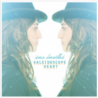
These are some of Sara’s
existing CD and single covers. We could use these as inspiration for our photo shoots
because they are of the same genre and we may use some aspects of her style on
Morgan so that the style of the artist does match the song and genre.
Analysis of chosen artist - music video
Sara Bareilles – Brave
Although this video is by
the same as our chosen artist, the overall sound of it is different therefore
I’m not sure how many aspects of this video we will find useful. She uses a lot
of match cuts of different people dancing, including herself. After a brief
analysis of the lyrics I think that the overall idea the song is trying to get
across is that no matter how low you feel right now, you always have to be
brave and do whatever makes you happy no matter what other people might say or
think. I think this idea is portrayed through the video in some of the shots of
the public dancing with another person / people looking at them, as the video
moves on, the people watching begin to accept it.

This particular shot is one
that really jumped out at me. She is walking towards the camera, which is
moving backwards. In the behind the scenes video, she mentions going to “sing
double-time” which I assume means that they play the track twice as fast and
she sings along, then they can under-crank this so that the visuals are in slow
motion but the track is still playing at normal speed. This is something I
think we should try out as it looks very effective.
Most of the shots have the
artist centre frame but I think we’ll use a range of framing to show our
knowledge and understanding.
Further research and analysis into existing promotion packages - Merchandising
I have looked into a few
different artists' merchandise products and I found that the artists actually have their own store for fans to buy
from. Creating products for fans to buy may increase awareness of the artist
e.g. if someone see’s another person wearing a t-shirt with an artists name on
it may motivate them to find out more about the artist and maybe purchase
albums etc. The merchandise stores usually have matching colour schemes to that
of the websites and sometimes album covers, which creates synergy. I think we will create some t-shirt
designs and maybe wristbands etc for Morgan and I could create a fake website
for them on Adobe.
Analysis of ancillary products - Adverts for albums in music magazines
Fun – Some Nights
This was on the back cover of Q Magazine. It is to promote
their new album as the target audience of the magazine is probably similar to
the TA of this music genre. I also found the front cover of the actual CD case
and their website. Their website colour scheme is yellow and black which is
probably why they have used these colours on this advert. However they have
used yellow as the more dominant colour here and not on the website because
they are the most contrasting colours and will attract attention of the readers
of the magazine. The CD case for Some Nights is the same as that being held on
the advert by one of the band members. This is a unique way of presenting it
but I think this would make the TA intrigued to find out what the album sounds
like.
 |
| FUN website |
 |
| Album cover |
Kate Rusby – 20
This advert was on the back of Mojo Magazine. It is
promoting her new album and upcoming tour dates. I looked on her website and it
is unusual that she has chosen purple as the dominant colour here as her colour
scheme on the website seems to be mostly pinks, blues, and vintage patterns.
The photo used on this advert is the front cover of her album which will help
the TA find the CD if they were interested in buying it. I have noticed that on
the adverts they include the logo of the record company in the corner so if we
were to make a promotion page like these ones we would have to put our logo in
to follow conventions. She has also included tour dates at the bottom of the
page, we could make up a tour for Morgan as more promotion.
 |
| 20 album cover |
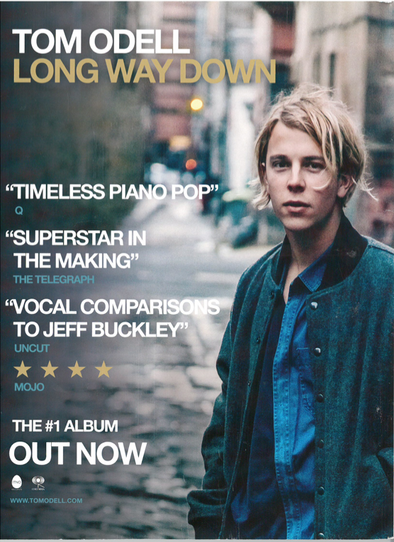
Tom Odell – Long Way Down
This entire page is filled with the photo used on the front
of his album cover for Long Way Down. The colour scheme is similar to that
found on the website, which introduces his house style. I find it effective how
there is a pull focus on the artist making the majority of the page out of
focus. The text is wrapped around the artist, which emphasises him as the main
attraction. This has influenced my research because I am now thinking of making
a page to promote Morgan as we could do it effectively but simply.
 |
| Website |
 |
| CD cover |
Jamie Cullum – Momentum
Again this is a simplistic but effective promotion page. The
photo used on here is an extended one of the album cover. They have kept the
colour scheme to the browns, blues, and golds used on his website which will
help the TA recognise him as an artist. As we are trying to launch Morgan, we
should keep to similar colour schemes for the video, photo-shoots and ancillary
products because she is a new artist and we are trying to get as many people to
recognise her as possible as it is an industry to make money.
 |
| Website |
Subscribe to:
Comments (Atom)


